Are you familiar with the growth-driven design (GGD) methodology? If yes, you probably treat your website and marketing materials as living, breathing entities that are never truly “finished” works. GDD is a term coined by Hubspot for a process to launch a website with better results in half of the time. The beauty of GDD lies in the continuous improvement that comes from collecting user data. However, all digital marketing should be rooted in constant experimentation, tracking, analyzing and optimizing of available data. This results in better recommendations to function and design that will ultimately lead to an increase in sales. Almost everyone is familiar with a Google Analytics account—but, have you heard of heat mapping?
Much like using infrared in a camera to detect heat, heat maps detect “hot spots” on your website. In this instance, “heat” is a metaphor we use to describe the most active areas on your website that users engage with, as well as screen recording user sessions on your website. Sounds pretty cool, right? That’s because it is. Yet, many companies do not leverage this enough despite it being an extremely valuable tool available to many at (in some cases) no cost at all!
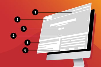
Track User Behaviors with Heat Maps
The number one reason to use a heat mapping tool is to track user behaviors. Heat mapping tools like Lucky Orange or Hotjar track user sessions on your website by creating a “map” of where the users point their mouse/finger. The most frequented areas of the page will be displayed in warmer colors—red, orange, yellow while the least popular areas will be in cooler tones—just like on an infrared camera.
Collecting this data will show you what areas of your site users are finding interesting and gaining attention. A button with 10 clicks will read hotter than a button with 1. You may discover that important information is getting skipped over. Or, that information you didn’t think was really all that important, actually is. Use these findings to decide if you should keep your current strategy or pivot to something else.
Track User Scrolls
One of my favorite parts about heat mapping tools is that they screen record user sessions at random. The beauty in this is that you can learn how far down your users are typically scrolling, and what they are stopping their scrolling for.
Most users are accustomed to scrolling and will almost always scroll down. The problem is that the further down they scroll, the more their attention drops off according to Nielsen. The same source also found that users spend 57% of their viewing time above the fold.
So, while users may actually be scrolling down the length of the page and seeing the content there, they are definitely paying less attention the further down they go. Connect your site to a heat map and see for yourself what is getting your users to stop—and how far down. It may surprise you. I’ve worked with plenty of clients who tell me constantly that information they are cramming at the very bottom of their page is super important. Yet a heat map indicates that users are either not seeing it or feel otherwise.
Heat maps do protect sensitive information. Form fields will be excluded for privacy reasons, and you can even purchase extensions to further protect your users’ sensitive information.
Make Data-Driven Decisions
Heat Maps allow you to justify whether or not the things you are developing on your website are actually valuable to the users—they are concrete proof of what your users are doing on the website
Data-driven / growth-driven design involves experimentation with trial and error. You may come to find things you thought would captivate users don’t and content that you thought they would be interested in, they are not. Or the opposite. Heat Maps tell you visually which areas the majority of your users care about, and what they are interacting with on your website. From a data perspective, it gives marketers the proof they need to say “this is/isn’t working” so they can pivot their strategies based on proven findings. While this form of data isn’t hard numbers in its truest form, it’s validating proof of what your users are doing. How much can someone argue with the visual behavior of actual users?
I love heat maps. They’re a great invention. Collecting this data helps you to make decisions that will enhance the experience of your website for your users. This helps whether you are using this to re-design a website or modify a “launchpad” website. Either way, heat maps are great indicators of things you can be thinking about to make your website more profitable. Pairing this with other powerful tools like Google Analytics can really give you some eye-opening insight into what your website is actually doing for you. Plus, you have the opportunity to experiment with something that could make it better.
Use Heat Maps To Maximize Engagement
Stop wondering about what entices users on your cool new website and start seeing it for yourself. Stop wasting time on “what-ifs” and unanswerable questions and start collecting the data you need to prove what your users are actually doing. Remember, if you’re launching a website and are not looking at what it’s doing, then you are doing it wrong.
Call us today to get started—our team of data-driven professionals would love to dive into dissecting the good and bad of your website and discover ways we can maximize user engagement and actions.