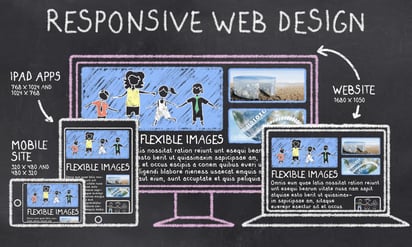
For the last few years, you may have heard the term "responsive" mentioned. In case you are not aware, the term is actually "mobile responsive." Responsive is a shortened version of the term. Mobile responsive designs are created with mobile users as a priority, although they work just as well on any type of computer screen. The concept behind mobile responsive website design is that the elements on the page move around according to a pre-programmed configuration depending on the size of the device screen. When the website receives a signal from the device, it will display the page in the configuration designed for that device. Typically, mobile responsive websites order the primary content first, secondary and other content afterward, followed by sidebar elements and bottom of the page elements. But why should you invest your money in this new design?
Your Audience
Before you decide whether a mobile responsive site design is right for you, you need to consider your target audience. Who are your ideal customers and where do they access your site? If the answer is mobile phones and tablets, then you need to seriously take a look at responsive themes. Here is why:
- 64 percent of American adults own a smartphone
- 42 percent of American adults own a tablet
- Of the figures above, 7 percent are mobile-device dependent for accessing the Internet
These statistics are from 2014 and the numbers are continuing to grow. If your audience is visiting your site on mobile devices, you want them to get the best user experience possible. The best experience is a mobile responsive design.
Difference in User Experience
If your site is a standard site, your customer can still access it from their mobile device. Once they land on a page, they need to resize the section they want to look at and often have to move it around to see all parts of an article or image. This can be negated somewhat if their phone has a "read" button. The "read" button picks up the text only and formats it for the reader. However, the read button does not work on all pages, and it takes only the text, leaving out any images, pictures or other sections.
If you have a mobile responsive site, when the user lands on your page, the site sizes itself automatically for their device. It changes the size and format of each element on the page, and reorders it. Your visitor gets the best possible visuals from your site without any effort. Additionally, they can see and click on any of the ads, images or videos you have there.
Other Benefits of Responsive Design
First of all, Google loves it. That in itself is a reason to switch. There are other ways you can have a mobile-friendly site, but they are not as good. You can use plugins or a separate mobile site as an intermediary measure until you can afford to invest in a responsive site. Depending on your site's platform, changing to mobile responsive can be fairly easy and inexpensive, or can range upward in price as if you are building a brand new site all over again.
Responsive sites are faster. They are designed for mobile users who like speed, and they save time because the user doesn't have to do anything to get them to load correctly.
Mobile Users are Ground Zero
There are more mobile users now than desktop users. In 2014, the threshold was passed. If you want to continue to grow your business, you should be designing for mobile users first, other users second. What do you think Millennials are using?
Industry Matters
Responsive sites are even more crucial in industries that get most of their visitors from mobile users. These industries include restaurant, marketing, social media, retail, technology and sports. While some industries currently lag behind, they should still be moving forward to responsive design.